Back to overview
Geostorylines - Visualizing Locations from News Articles
The goal of this project was to
visualize the people, locations, and dates mentioned in a dataset of news articles for the data journalists at a french newspaper. The
ILDA team already made a first visualization — My tasks was to
add the locations in the data to their visualization. To do this I collected possible designs through a literature review and a sketching workshop, then created three alternative designs which we compared through a user study.
Duration: March 2020 - September 2021
My role: I executed all the steps of the project except the implementation and the final evaluation. I was supervise by
Anastasia Bezerianos and
Vanessa Peña-Araya.
Result: A study published together with my supervisors in an
IEEE journal
Process Overview
1 | Problem
What do the data journalists need from the visualizations?
1.1 Data Exploration
1.2 Storylines
Journalists need to find patterns in how people and locations are connected over time
Invisible Tag
Problem
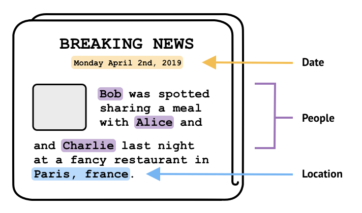
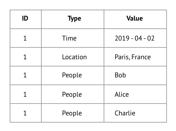
1.1 Data Exploration — Understanding the news article dataset
The dataset I worked with described 152 news articles. For each article the data contained:
• The date the article was published
• The names of the people mentioned in the article
• The names of the locations mentioned in the article
As you can see in the example, each row in the dataset contains on of these three types of datapoints. The datapoints from one article are linked together through a shared ID.
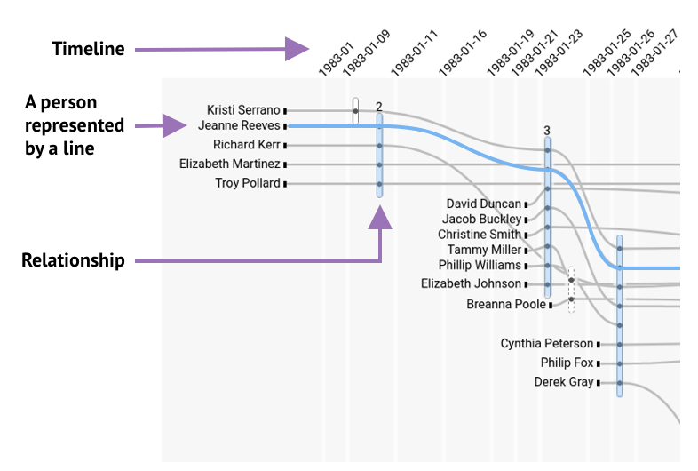
1.2 Storylines — Our starting point
When I started my project, the
ILDA team had already built a first visualization for the data journalists based on
Storyline visualizations. Storylines are a formalization of XKCD’s
narrative chart, which visually summarize movie plots.
Data journalists want to find patterns in who is mentioned together in the news, when they are mentioned and in connection to which locations. To find meaningful patterns in locations, it’s useful to know about their geographical context. To create a visualization that meets these needs we will integrate maps into Hyperstoryline visualizations.
Generate
2.1 Literature Review — Is there already something we can use?
I started by searching for a visualization in the academic research on Storylines. I found 15 papers describing different ways to augment Storylines. Some even have locations!
All the examples of Storylines I found in the literature suffered this same limitation. Even searching through different types of visualizations I could not find a visualization that met our needs, so we decided to create our own.
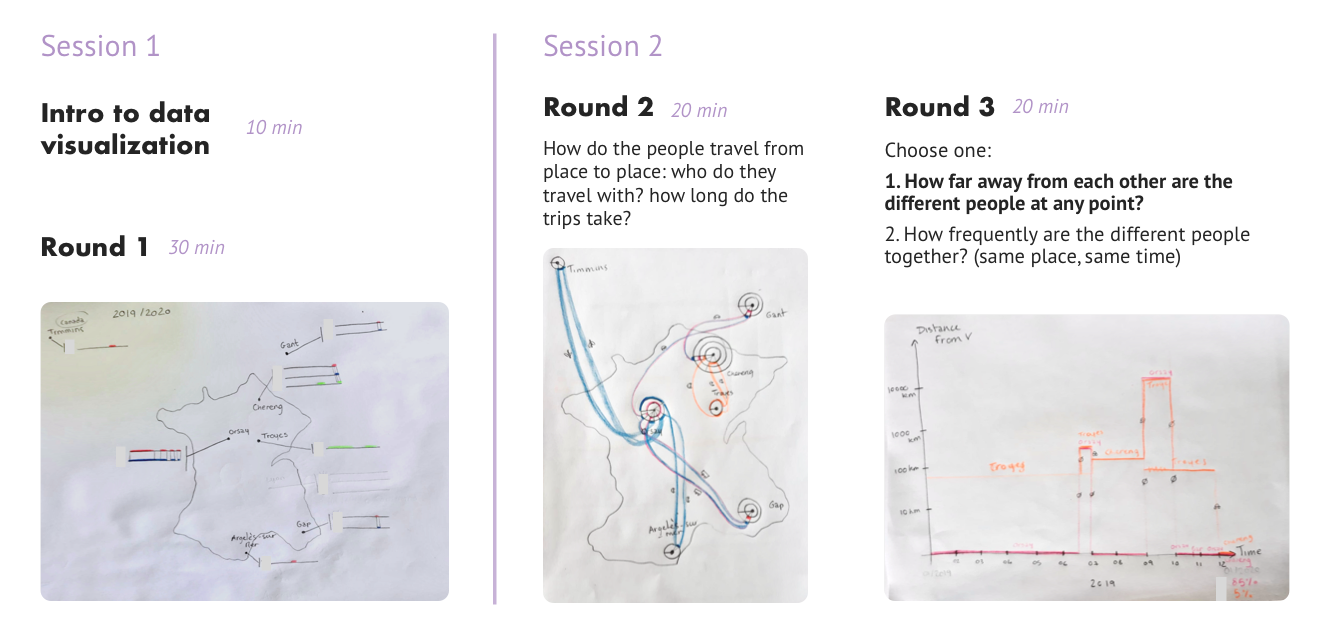
2.2 Sketch Workshops — Lets create our own!
To make sure we got a large variety of visualization designs, we followed the method used by Tang et al. (2019) — have participants sketch visualizations by hand.
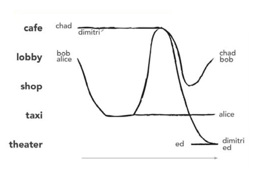
I recruited 11 participants and divided them into 4 groups. Each group participated in two sessions of 1 hour in which they drew at least three visualizations. Below you can see an illustration of the process.
After a short introduction to information visualization techniques, participants were free to sketch their data however they wanted. In the second session we guided their sketching through prompts. We did this to push participants to produce more complex visualizations.
Due to COVID I conducted the workshops online using a combination of Zoom, Google Slides, and Miro. One unforeseen challenge was that not everyone had the same sketching materials. Another challenge was that not everyone had a camera nearby to quickly upload pictures of their sketches to the Miro board. This caused time delays and imposed limitations on what some participants could sketch.
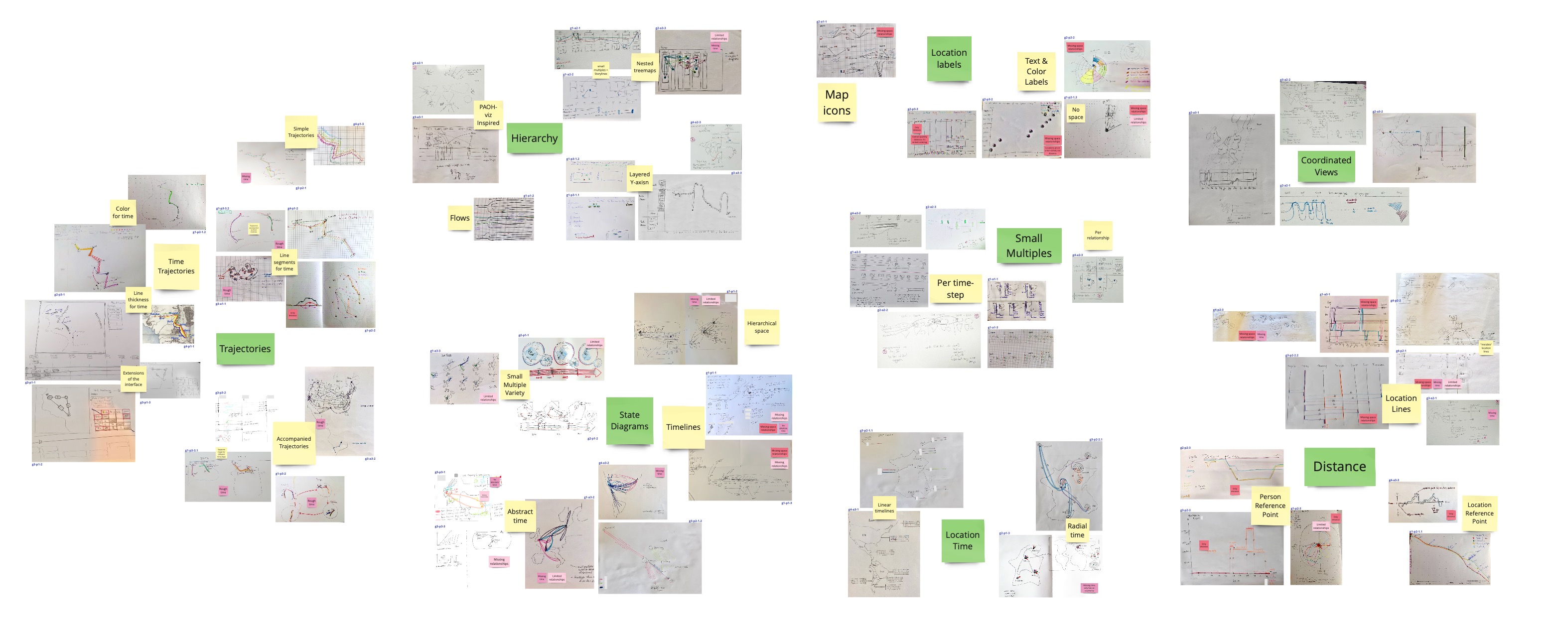
2.3 Result Analysis - So what did we do with the sketches?
The workshop participants produced 67 sketches! To extract visualization designs from these sketches I had to analyze how the sketches differ.
Step 1: Bottom-up sorting of the sketches
I clustered the sketches based on similarity in two rounds, which resulted in the 8 clusters you see below.
Step 2: Eliminate clusters
I removed two clusters: the Distance cluster and the Location Labels cluster. Neither cluster could show the complex relationships between locations that the data journalists require.
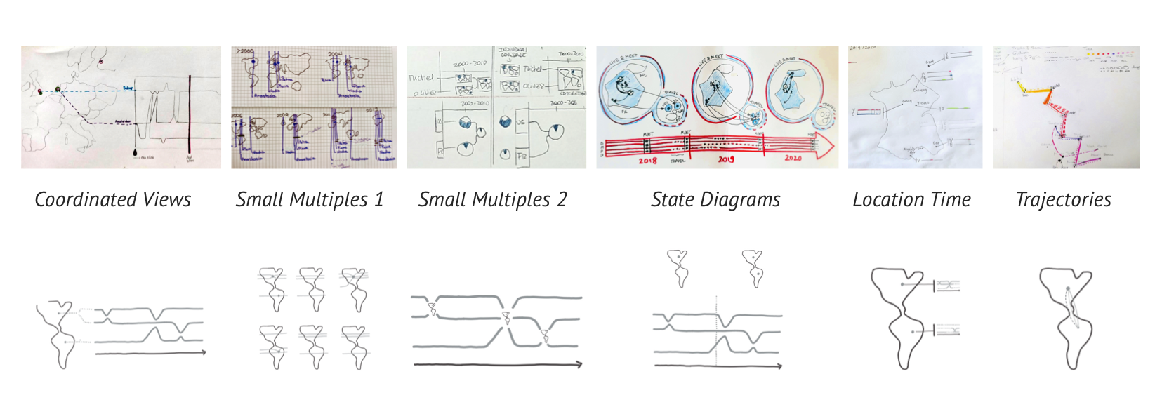
Step 3: Extract Designs
Next I created a visualization design based on the sketches in each cluster. I made minor adjustments to adapt the designs to Storyline visualizations.
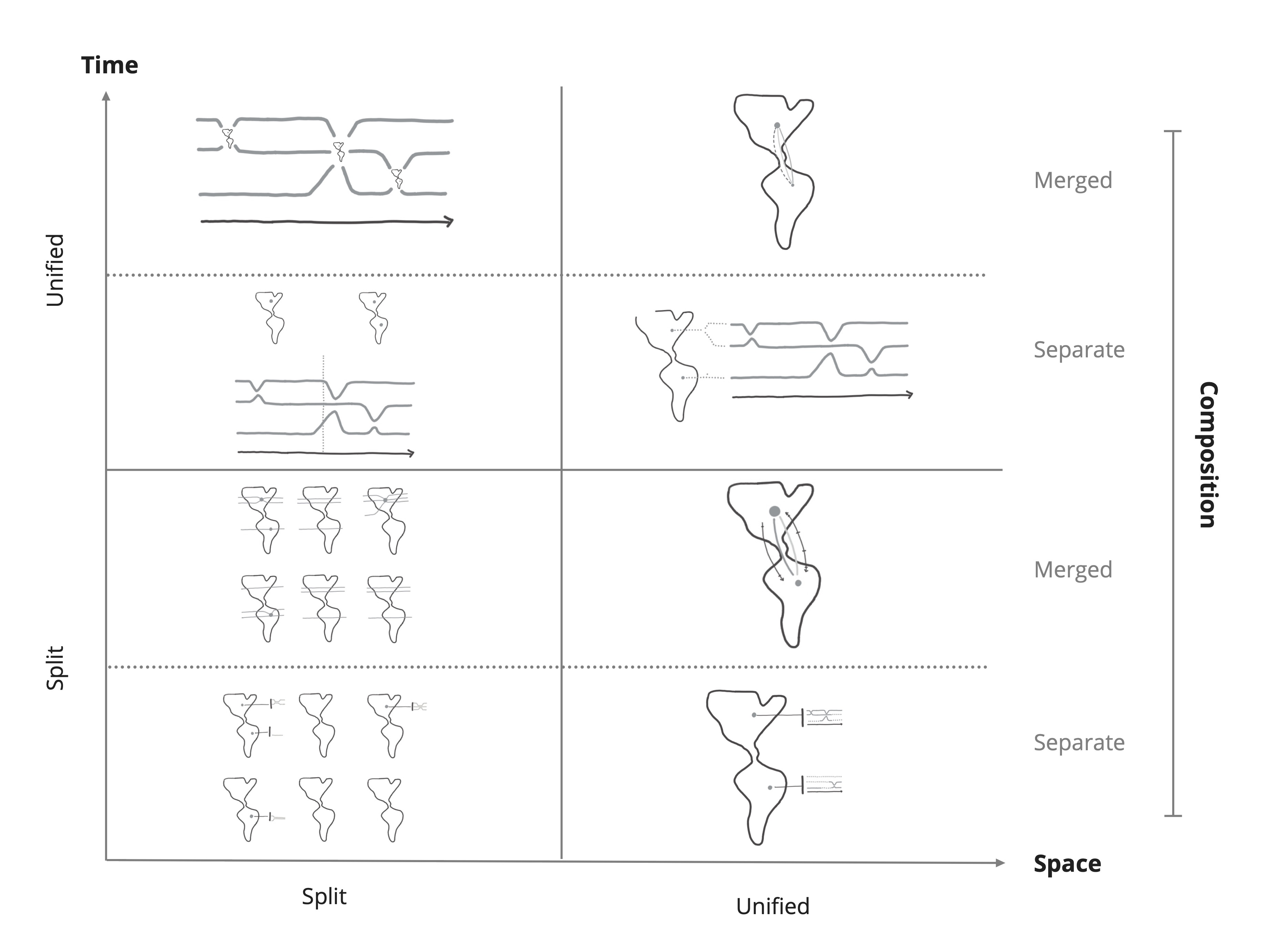
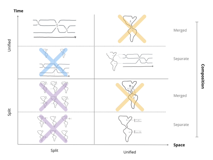
Step 4: Design Space
A design space is a structural overview of how the variations of a design differ from each other. My design space categorizes the results of the workshop according to three dimensions:
• How they visualize time,
• How they visualize space,
• How they combine the visualizations of time and space (composition).
To explore as many possible designs as possible I conducted a series of workshops where participants sketched visualizations. This produced a lot of sketches which I used to extract 6 possible designs. I then described how the designs differ in a design space which enabled us to make an informed selection in the next phase.
UX Design
3.1 Selection — How we picked the top 3 designs
It would be too much work to test all 8 visualization designs in the design space, so we chose the three best ones. We proceeded by elimination:
• The two designs in the bottom left quadrant were eliminated because splitting both dimensions made the visualizations too hard to read.
• We eliminated the two designs that use paths on maps because they struggle to show when two people are linked to the same location but at different times.
• The two designs in the top left quadrant both show one map per tilmestep, but the bottom design requires more metal effort to combine the information, so we eliminated it.
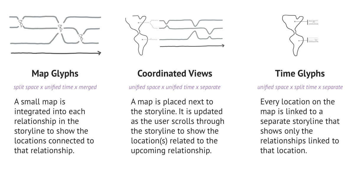
The following three designs were left:
Invisible Tag
3.2 Interaction Design — How do you interact with all that data?
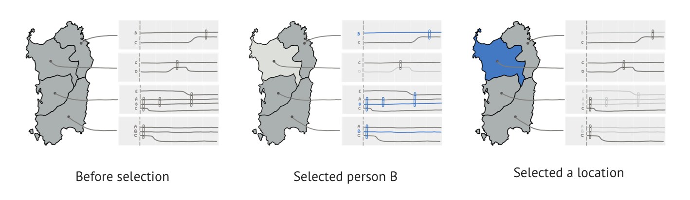
As I described in section 1.1, the data journalists work with relatively big datasets. However, they need to observe individual datapoints (like individual people) to find the patterns they are interested in. To show all of the many datapoints, we chose to make the visualizations interactive:
1. Users need to scroll through the visualization to see all of the data,
2. Users can filter the data by selecting people, dates, or locations.
Filtering turned out to be more complicated than expected. The basic mechanism is: you select a person/date/location, it is highlighted in blue, and everything that’s not related to your selection is faded out.
But what happens when you select more than one object? At first we used inclusive selection: anything connected to any selected object stays in focus (everything else is faded out). This turned out be confusing to users, so we switched to exclusive selection: only objects related to all selected objects remain in focus.
We selected the best three designs by elimination: Map Glyphs, Coordinated Views, and Time Glyphs. To accommodate the large datasets, we made the visualizations interactive. This means users need to scroll through them to see all the data, and that they can filter data by selecting people, dates and locations.
Evaluate
4.1 Study Design — How do we compare the designs?
We wanted to compare how good our three designs were at visualizing the data. Now remember that the goal of my project was to add locations to ILDA’s existing Hyperstoryline visualization. So this study focused on how well the designs enabled users to identifying patterns in the locations.
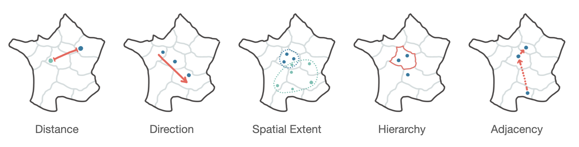
From the literature we extracted the 5 spatial patterns shown below.
In the study we asked participants to complete tasks for each spatial pattern, for example:
Determine whether the places where A and B meet are spread out or concentrated in a localized area. (spatial extent)
We then measured whether their answers were correct (Error rate), how long they took to answer (Completion time), and how they felt about using the visualization (Confidence).
In our pilot test it became obvious that the study took far too long, so we simplified it by reducing the number of spatial patterns. As participants used the exact same strategy to answer the distance, hierarchy, and spatial extent tasks, we kept only one of them — Distance.
4.2 Hypotheses
Two of the spatial patterns (Direction and Adjacency) are defined by the order in which locations are visited which gives them both temporal dimension.
Some of the questions we got were:
H1: For Direction and Adjacency: Coordinated Views > Map Glyphs > Time Glyphs
H2: For Distance and Baseline*: Coordinated Views + Time Glyphs > Map Glyphs
*The baseline task asked users to count all the locations connected to person A and person B.
We were also interested in how the visualizations would perform if we increased the number of locations on the maps.
H3: When Scaling the number of locations in each task: for larger number of locations we expect to see better performance in: Coordinated Views > Map Glyphs > Time Glyphs
4.3 Results — So which design is best?
Unfortunately, my internship at ILDA ended before we could start the study. While I wasn’t part of running the study, I did stay in contact with my supervisors to hear of the study’s progress. Here's a summary of the results:
• Participants were able to correctly identify the patterns in the locations using all three visualizations.
• Coordinated Views was most efficient, and preferred by participants.
• Against expectations, the Map Glyphs design did not produce more errors despite its smaller maps.
Reflection
I enjoyed exploring the field of information visualization during my internship. I discovered an array of new visualizations, and learnt about all the considerations that go into selecting the right one.
My favorite part of the project was running the workshops and being amazed by the creative visualizations our participants drew. I also discovered how difficult it is to keep to time schedules in workshops, and important it is to plan in buffers for unforeseen problems!
I regret I wasn’t able to talk to the data journalists. It would have been valuable to know what kinds of patterns they search for, and it would be amazing to test my visualizations with them using real data.
My supervisors published an academic paper based on the results of my work. You can find it
here!
Thank you for reading 🗞️