Back to overview
An App to Schedule River Pilot's Voyages
To transport cargo from the sea to central Europe by river, shipping companies have to engage the services of river pilots. Historically, shipping companies use a third party booker to hire pilots. The goal of this project is to build an app that enables direct communication between the shipping company and the pilots, and which allows pilots to avoid large booking fees.
The project seemed straightforward at first, but talking to the pilots quickly revealed how unpredictable their profession is! From initially vague voyage times to last minute cancellations, there are plenty of challenges to design for.
Duration: September 2022 - Now
My role: I am the only designer on this project, but I've been working closely with a developer from the start.
Process Overview
4 | UI Design
...Coming up next
User Research
This project involves two types of users:
• Agents from a shipping company that owns a handful of ships
• A group of around 5 river pilots
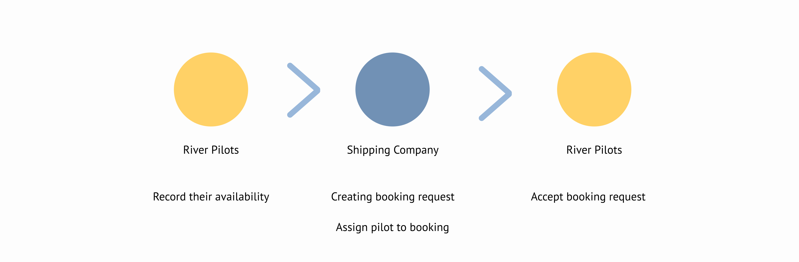
From the initial project requirements, I thought the communication between the two would go something like this:
Pilots indicate when they're available, then the agents at the shipping company use this information to select pilots when booking requests - which the pilots accept or decline.
I wanted to conduct user research to confirm this process, but ended up discovering it's more complex.
1.1 Interview
I like starting user research with user interviews. It's a quick way to build a basic understanding of users' tasks and needs, which you can then strengthen with different methods.
I prepared a set of questions around the general topics I wanted to discuss with the pilots: what the steps of the process were, and what they needed at each step. Because the booking process seemed straightforward I was most interested in what could go wrong: what problems do they have with bookings? How do they solve them?
The most important thing I learned from the interviews was that it's the pilots and not the shipping agents that decide which pilot gets a new booking.
1.2 Observations
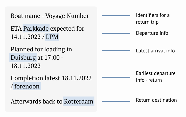
During the interview I learned that the pilots are currently using a WhatsApp group to communicate with the shipping company agents. They let me join this group so I could observe their planning directly.
Invisible tag
1.3 Analysis
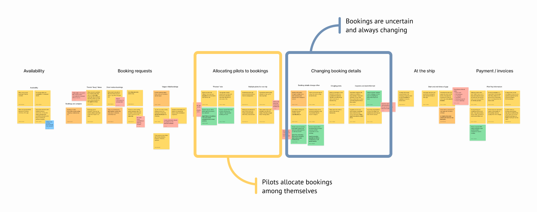
I like using Miro to sort the insights I gather during user research. Using digital post-its I can easily re-order insights to give them structure. I can also easily use the color of post-its to distinguish between types of insight. Here for example, green post-its contain explicit feature requests.
In this case I organized the insights along the pilots' user journey - from recording availability to sending in invoices.
The two main insights from the research are:
1. Contrary to my initial belief, pilot are not chosen by the shipping agents. Instead, it's the pilots themselves who assign pilots to bookings
2. Booking requests are both uncertain and unpredictable. Bookings time change continuously, and bookings can be cancelled last minute, or spontaneously extended.
Wireframes
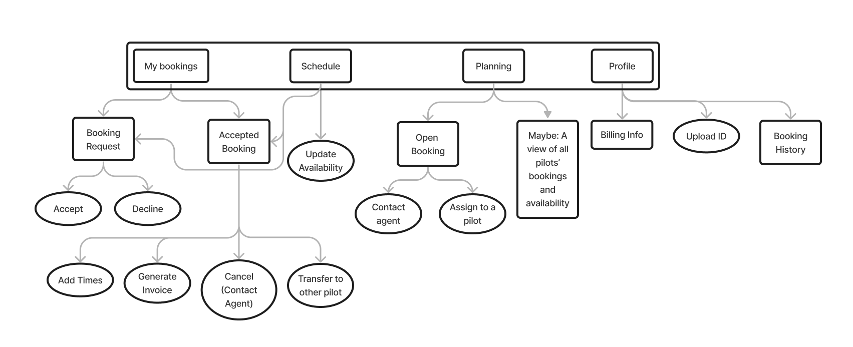
2.1 Task Flows
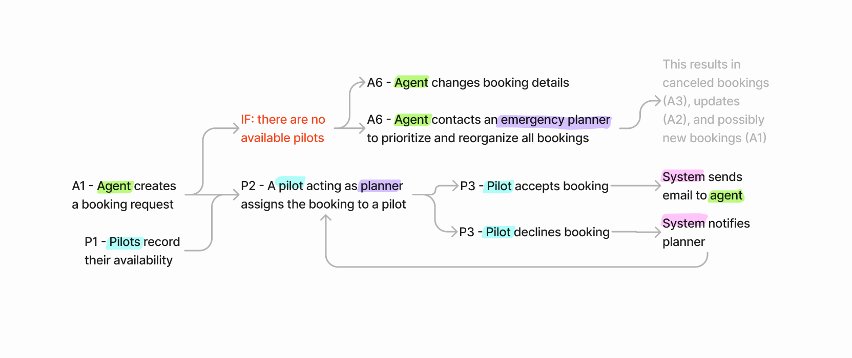
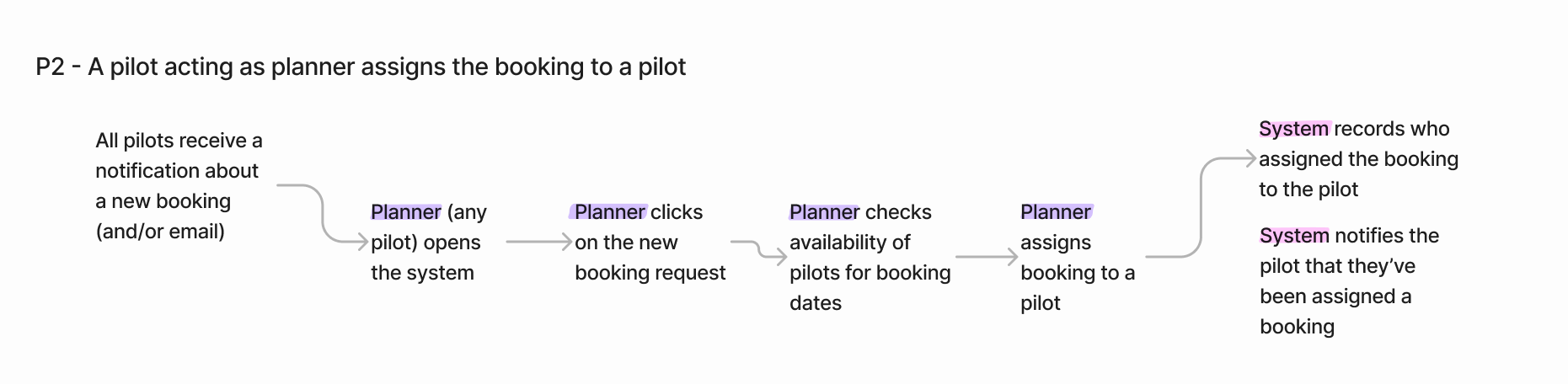
Based on the user research I mapped out all the tasks that pilots would have to perform in a booking system. I created tasks flows at two levels: a high-level flow for each the main stages of pilot bookings, and detailed flows for each action.
2.2 Information Architecture
Creating the task flows also helped define a hierarchy of tasks: which tasks would pilots have to carry out most often? Which are most crucial?
Three tasks have almost equal importance:
1. Managing the user's individual bookings (accepting requests, finding updates, recording times, sending invoices)
2. Recording the user's availability
3. Allocating new bookings to pilots
I chose to use these tasks as the top-level of the information hierarchy.
I found it impossible to define the information hierarchy without thinking about the wireframes. While I present them here one after the other, it was much more a back-and-forth process.
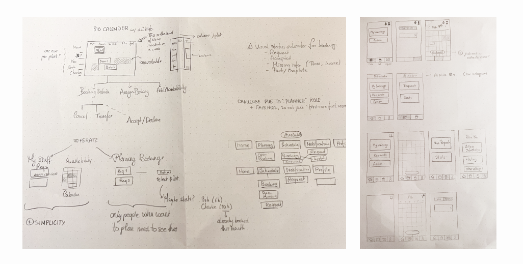
2.3 Wireframes
I've tried drawing wireframes on my iPad, but somehow nothing beats the freedom of quickly sketching on pen an paper.
The main design choice I wanted to explore was how to separate between all the bookings of all the pilots, and just those bookings belonging to the users.
The pilots plan to take turns being responsible for allocating new bookings to others. I didn't want to define a hard 'planner' role, so all pilots should have access to an overview of all bookings and the ability to allocate new ones.
Showing all bookings in one view was too cluttered for a mobile-first solution. I also assumed that pilots would only be interested in their own bookings most of the time, so it made more sense to separate the overview into a separate page.
I also explored different navigation models, including hamburger menus, tabs, bottom menus and mode switches. I settled on a bottom menu because it gives equal importance and discoverability to the key tasks I identified earlier.
Iterating
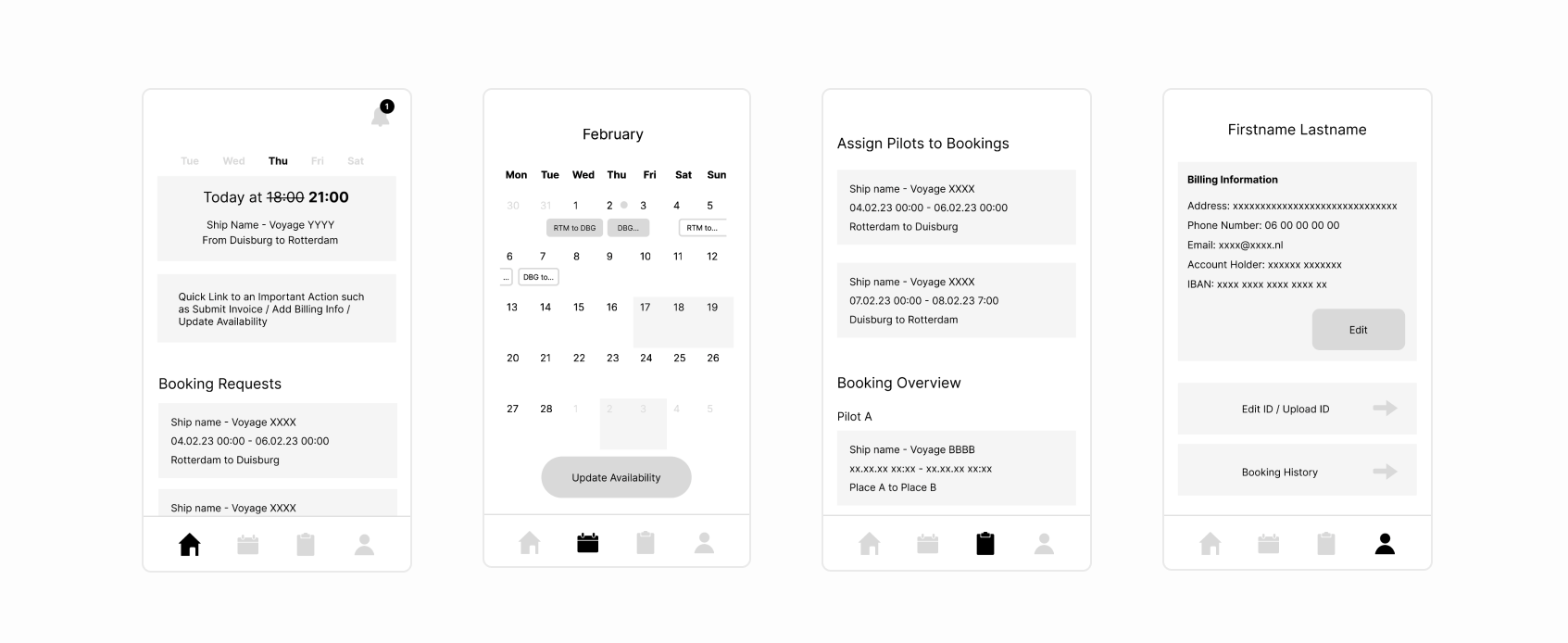
3.1 Interactive Prototype
I wanted to check with the pilots that I was on the right track with met designs, so I decided to test the wireframes with them. I built an
interactive prototype in Figma to test that I had both the correct content, and that my interactions made sense to the pilots.
Invisible tag
3.2 User Testing
I returned once more to my task flow hierarchy to create set of representative tasks that covered the most important functionality. These tasks were:
• Accept a new booking request
• Find the new departure time of your next trip
• Send an invoice for yesterday’s trip
• Record your availability
• Assign a new booking to a pilot
I tested my designs with two pilots over zoom. I sent them a link to the prototype and asked them to share their screen, and talk me through what they were seeing and thinking. After they completed the tasks we talked more generally about what they thought of the app so far, and what parts were most valuable to them.
Remote testing is unpredictable! At the start of the second session it turned out that the pilot didn't have a microphone on his computer. Some quick emails later, we combined screen sharing over zoom with a face-time call.
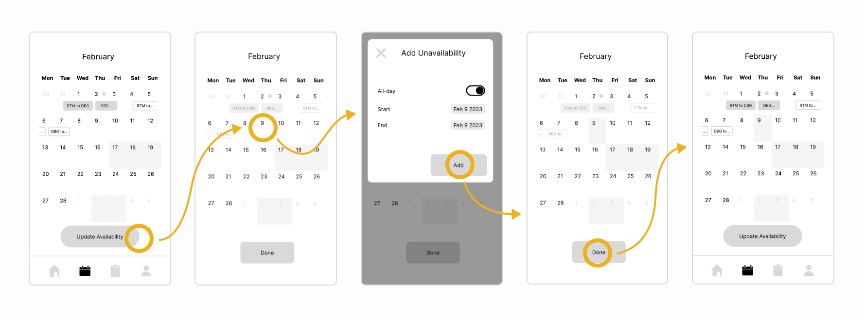
3.3 Results
The user testing was very informative, and it would take too long to go over everything I learned, so I will present one finding here.
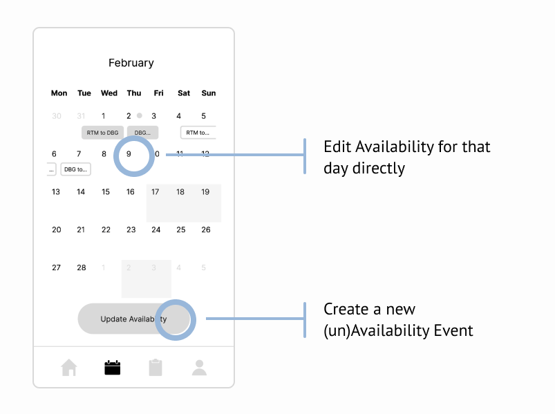
Below you can see the intended interactions for the task "You have an appointment on Feb 9th and so aren't available to work. Block that day in the app."
In conclusion, novice users need the availability button to discover the functionality. However, an event-creation dialogue is amore appropriate effect of the button than a mode change.
Expert users can use a shortcut by directly tapping on the date they want to edit.
Next Steps
I'm currently making some significant changes to the wireframes, so I plan to test them with the pilots once more. Up next is the UI design for the app.