Back to overview
Designing a Skateboard Webshop
I've been using Figma for years, but I knew there was more I could learn about using it to build UIs. So last September I followed an online course on
Udemy. In the course I worked on a
case study about a fictional skateboard brand, and learned to use
components,
auto-layouts, and color and font
styles (not to mention
many keyboard shortcuts).
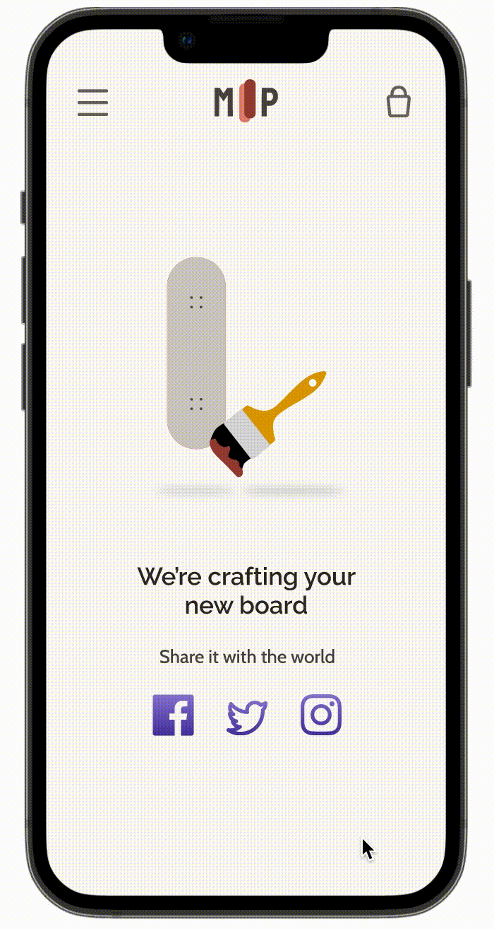
In this portfolio entry I present the process I followed in designing the skateboard webshop. One of my favorite parts of this process was creating my own loading animation. There is a lot I still want to learn, but animating definitely moved up on my list.
Duration: September 2022
My role: I generally followed the process set out by the course instructor, but created all the designs myself.
Final Result: An interactive Figma prototype that you can explore
here!
Process Overview
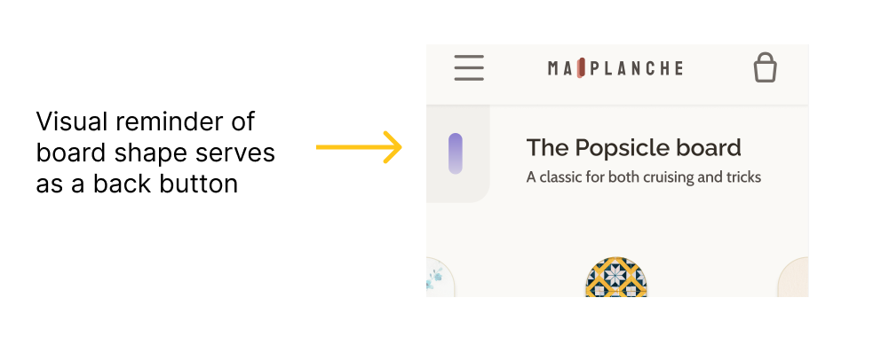
Invisible Tag
The Challenge
1.1 Target User
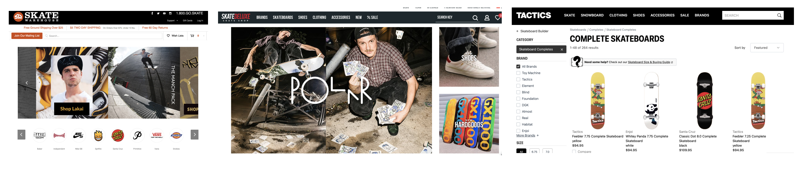
1.2 Competitor Analysis
A first thing that stands out is that these shops are clearly targeted at men. The websites almost exclusively show images of men and display an alternative street-culture aesthetic. Neither of these aspects are likely to appeal to Zoe.
1.3 Challenge Definition
After looking at existing skateboard webshops, I felt there was a mismatch between what already exists and what a person like Zoe would be interested in. First the websites are masculine in their aesthetics and representation of skaters, and second they make customizing boards seem complicated.
I knew that Zoe likes fashion and that
personalization has been a trend in fashion, so I wanted to support Zoe in customizing her own board.
How can we make buying a skateboard online more approachable for Zoe while still allowing her to create her own unique board?
Solution
One way to make buying a skateboard online more approachable for Zoe is to simplify the customization process. We can do this by breaking down the process into clear steps, and giving users relevant information in the moment they're faced with decisions (reducing demands on their memory).
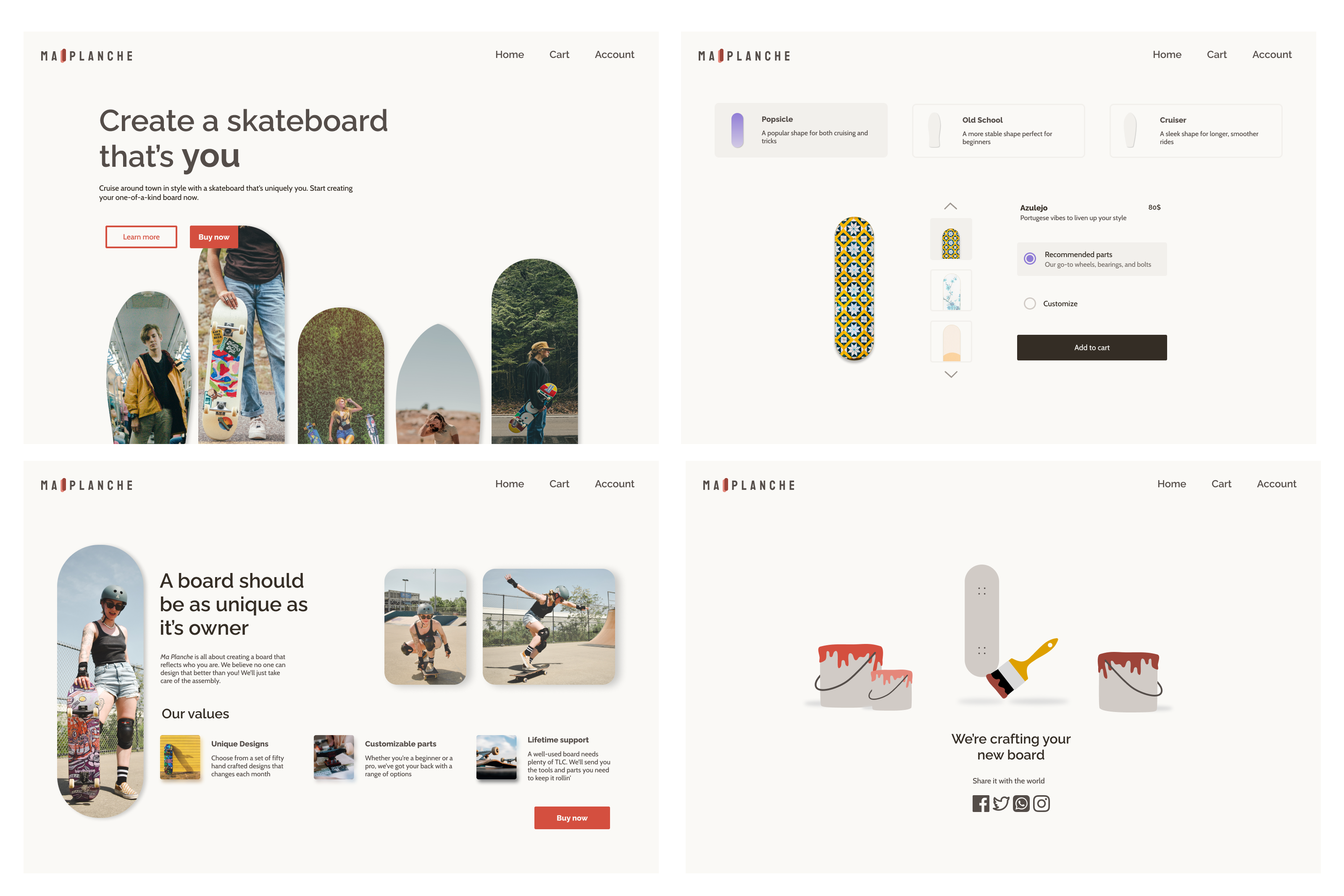
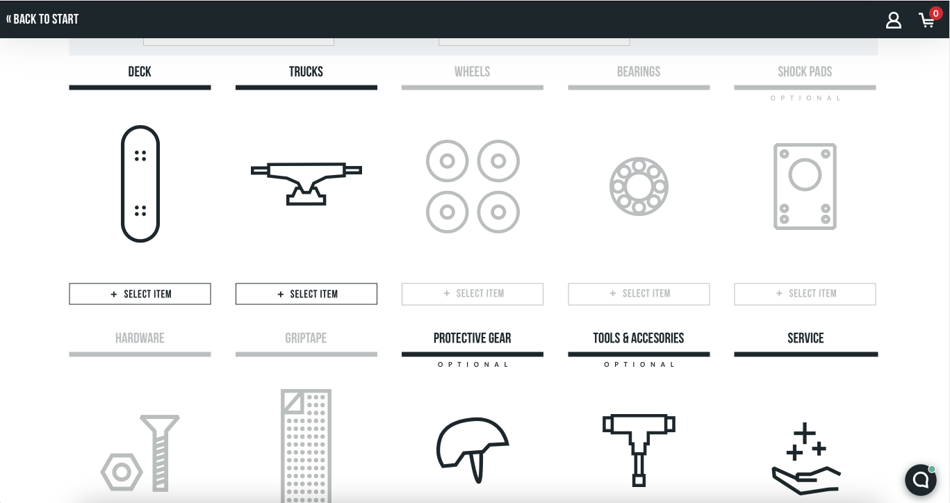
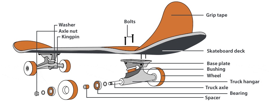
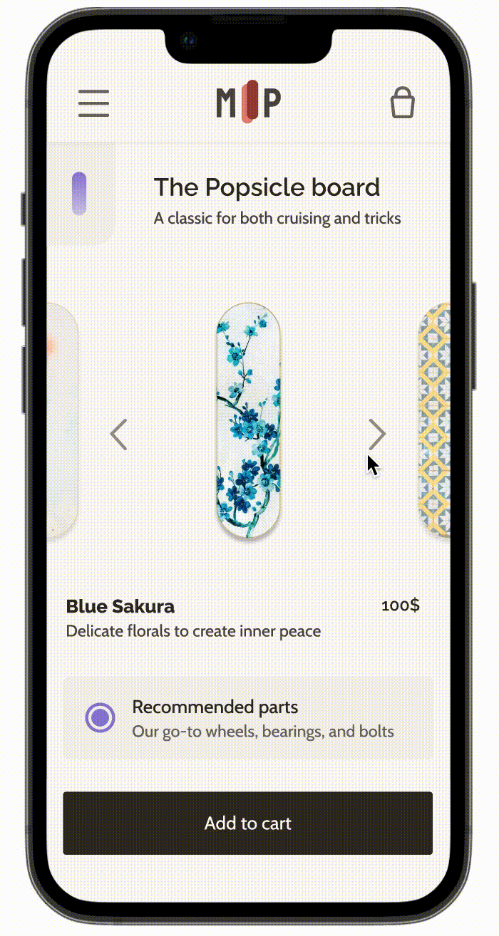
2.1 Customization Process
What you use a board for roughly corresponds to three shapes of boards: The popsicle for tricks, the old school board for beginners, and the cruiser for, well, cruising.
Many of the other customization options can be inferred from what someone wants to use their board for, so it makes sense to have the board shape selection as the first step in the process. We can then offer a selection of accessories as a default, making the process easier for users.
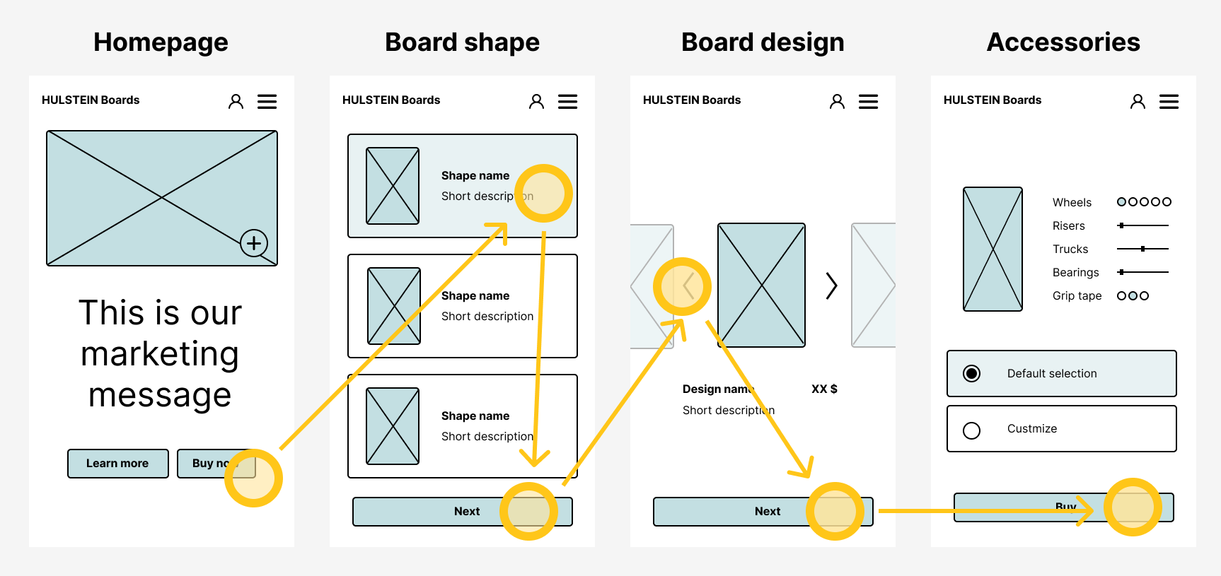
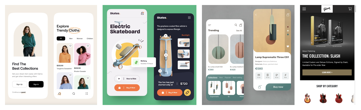
2.2 Wireframes
Between the standard pages of a webshop (homepage, basket, checkout) and the skateboard customization process I had enough information to build the wireframes.
To simplify the customization process I divide it into three setps: board shape, design, and accessories. The first step asks users to pick board based on what they want to use it for. From this choice we can infer matching accessories and offer them as a default. If users choose to change the default selection, we explain what each change means in simple terms.
Visuals
3.1 Inspiration
I wanted a more feminine and fashionable look for my website. For inspiration I started by looking at dribbble with keywords "skateboard" and "fashion."
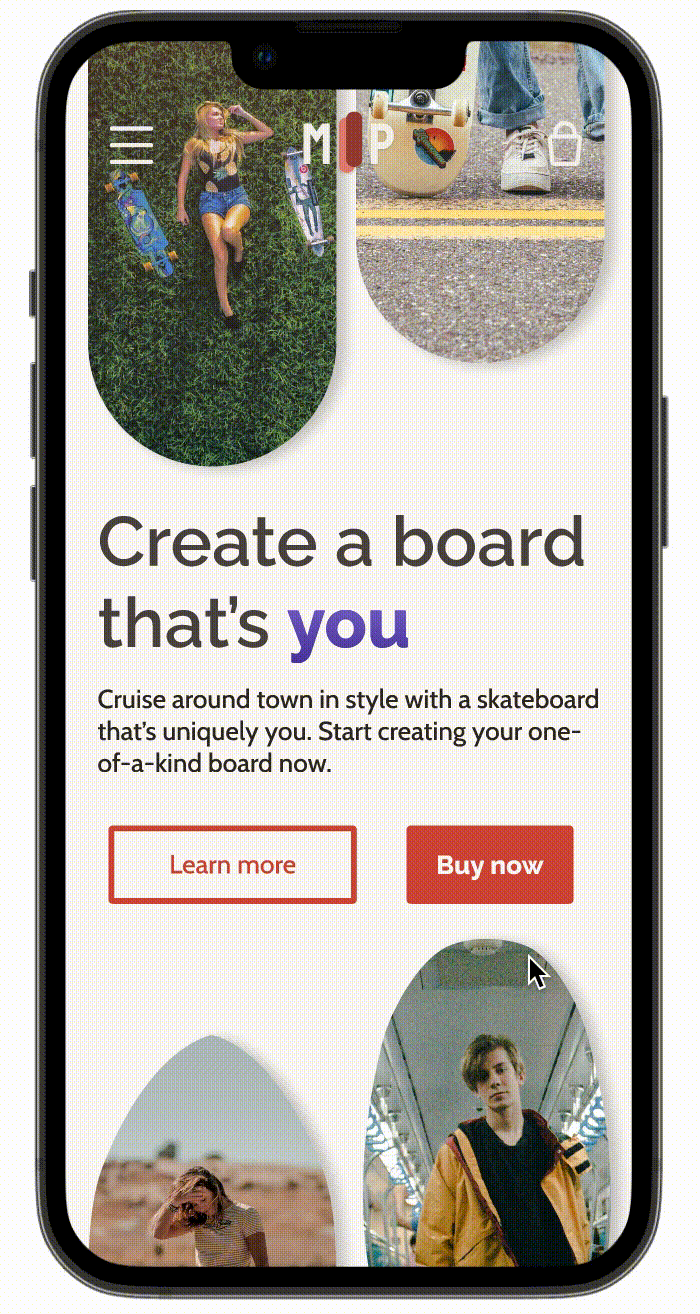
3.2 Logo, Colors & Fonts
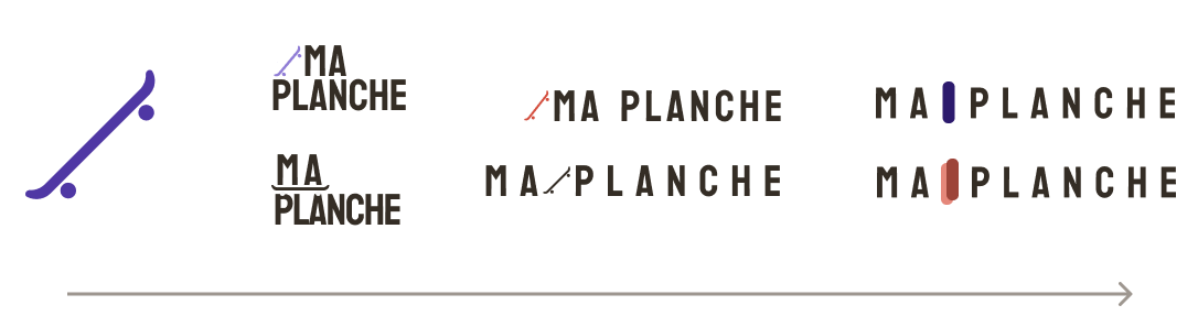
Brand Name: The course suggested using your own name, but "Hulstein Skateboards" didn't sound fashionable enough. After some brainstorming I settled on Ma Planche, which is french for "my board."
Logo: I wanted something quick and simple. Based on the image by Konstantin Reshetnikov I created a very simple skateboard. I experimented with its placement, but didn't end up liking any of the options. Instead I tried a top-view of a skateboard, tried some different colors, and liked the dual-tone option.
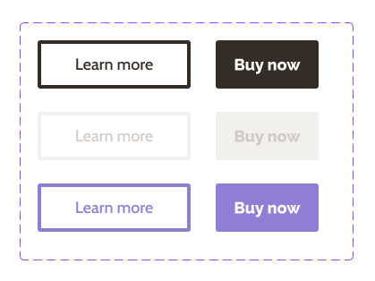
Colors: The interfaces of fashion websites like net-a-porter are mostly black and white, but some, like Zalando use more color on the homepage. For a more classy feel, I chose two muted colors: a brick red primary color (#D44F3F) and a blue-violet secondary color (#4F37A4).
Fonts: I used Google fonts to find two fonts that went well together: a more playful one for headings and buttons (Raleway), combined with a simpler one for body text (Cabin).
Here I had one of my main learnings from the course: using color and text styles. Using these document styles allowed me to keep text and color consistent across the UI easily, and to try out different colors combinations with a few clicks!
3.3 Photos
Another way to make the skateboard shop more approachable for Zoe is to increase the representation of women skaters. I searched for a range of photos showing women skating on Unsplash.
UI Design
4.1 Page Layouts
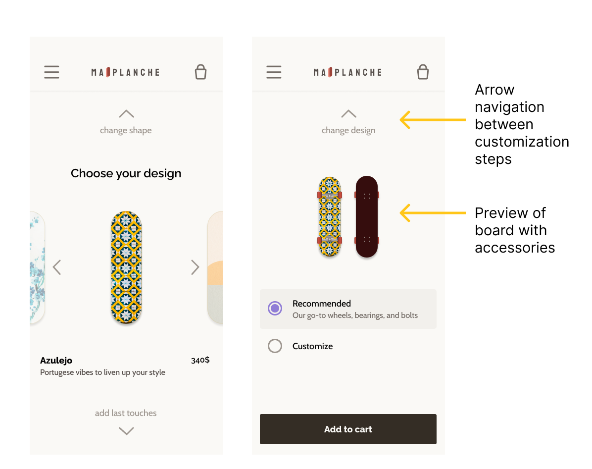
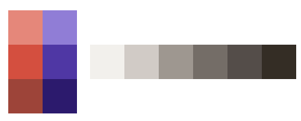
I posted alternative designs on the course forum and asked for feedback from other peers to iterate on designs and choose between alternatives. Below is the final design of the customization process.
4.2 Page Transitions
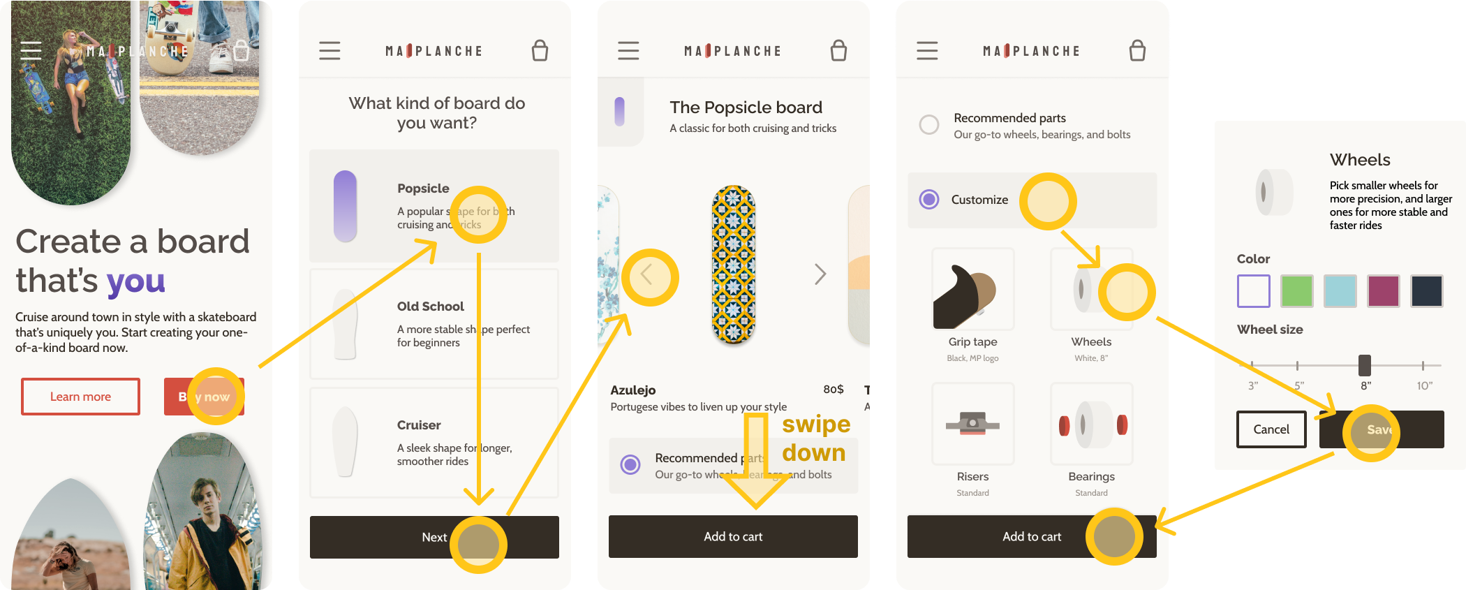
Next the course covered how to create animations in Figma. I found that animating page transitions really made the prototype feel real. The first animation you see below I copied from the course, but the other two I created myself.
For the board shape selection I wanted the options to come in one by one to encourage users to consider them all. Note that the animations in the gifs below appear slower than they are in the prototype.
Invisible text
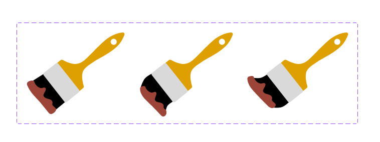
4.3 Animations
The animation is a bit too simple to match the aesthetics of the rest of the website, but I'm proud of what I achieved!
I learned to use
symbols and
auto-layouts to build up interfaces from individual elements. For tough design decisions I
explored different options and gathered
feedback.
Animating page transitions brings it all together in a final
interactive prototype you can see
here!
4.4 Web version
The final step of the design process was to adapt the mobile designs to a web size. After the limited screen real estate on mobile, it was difficult to fill the space on web.
I noticed this especially in the customization step. Splitting the process into three different screens made each screen feel too empty. So instead I decided to use the extra space to combine them in one page.
Reflection
Completing this project was a fun way to learn more about the power features of Figma. I have used what I learned about styles, symbols, and auto-layouts in every project since completing the course. It was also a great opportunity to experiment with different layouts, colors, fonts, and effects.
Looking back I notice that I based a lot of the visual design decisions on intuition. It would have been better to define a goal I wanted to achieve through the visuals and base decisions on that. It's also important to then record how design decisions contribute to this goal.

